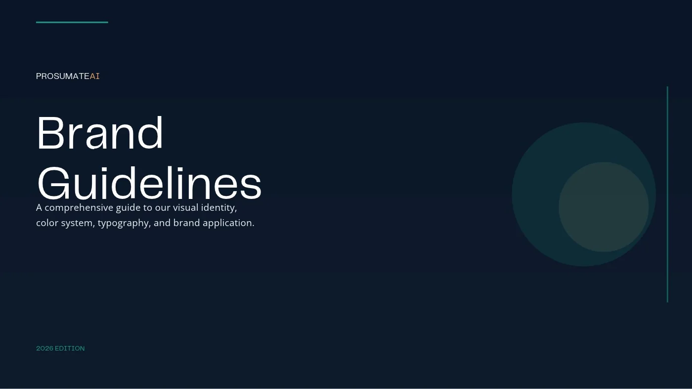
ProsumateAI
AI automation and growth company. Logo, colours, type system and brand guidelines.
Brand identity portfolio
I design complete brand identities for founders: the strategy underneath, the mark, the colour and type, the guidelines that keep it consistent, and the packaging, merch and screens where people actually meet it.
Each identity includes some or all of: strategy · logo suite · colour · typography · voice · guidelines · packaging · merch · social
Travel consultancy · Study, work and relocation abroad
“We chart the journey.”
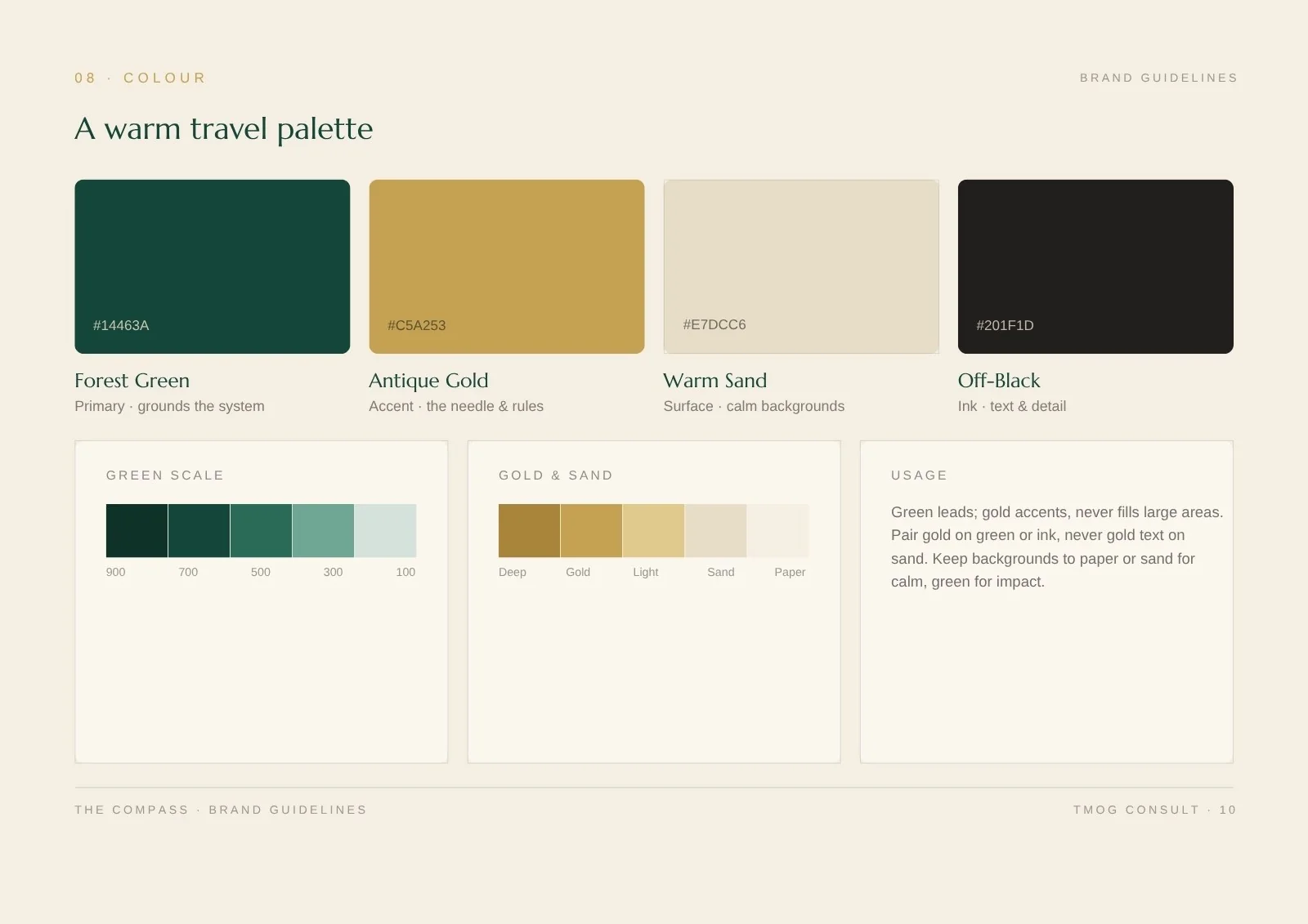
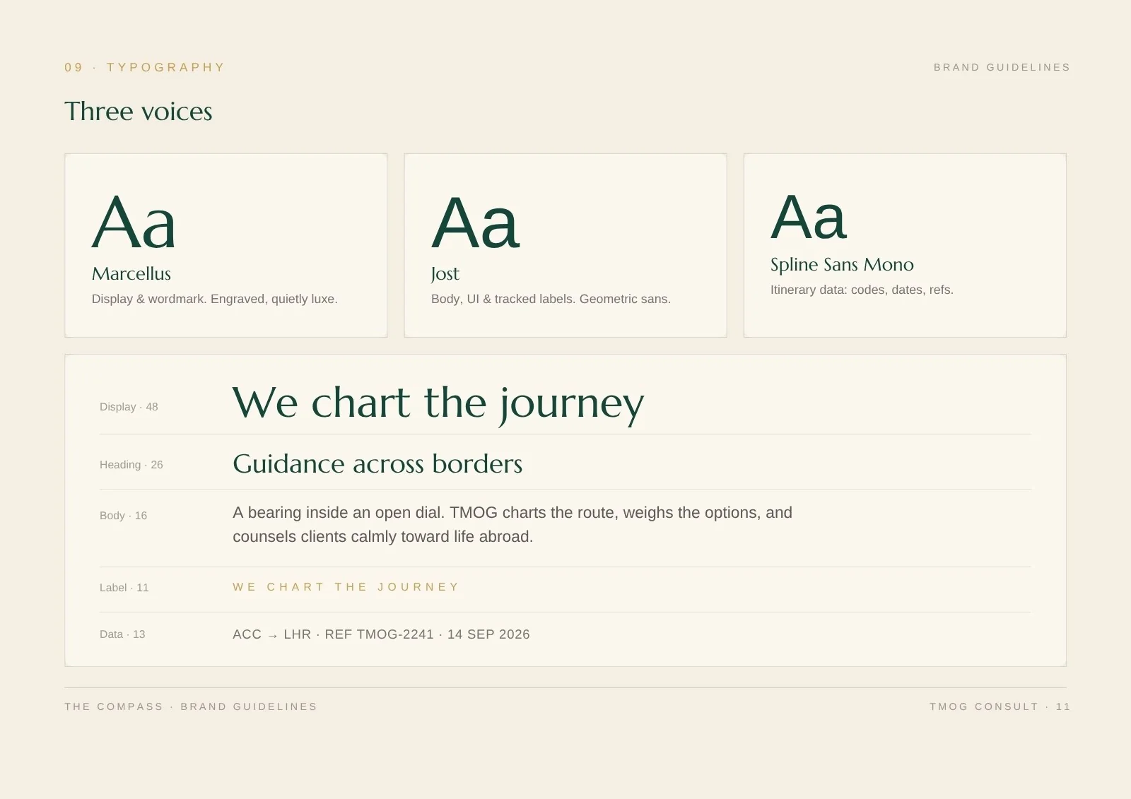
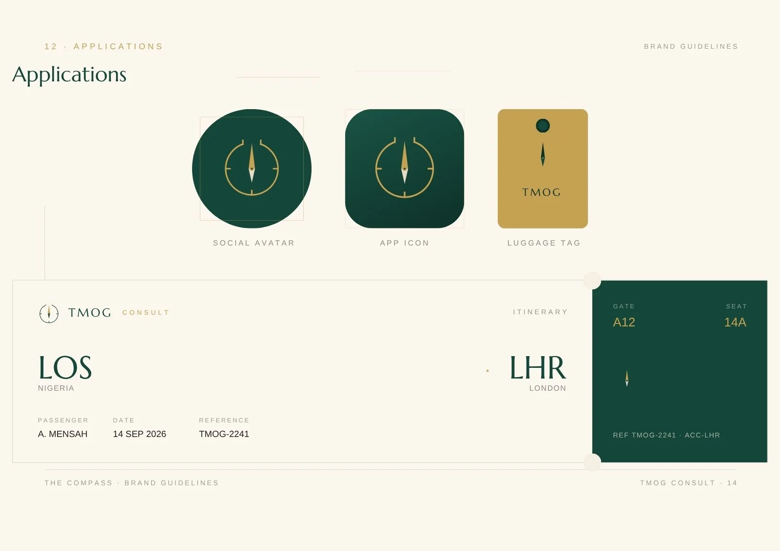
Moving abroad is daunting. TMOG Consult needed a brand that feels like a steady hand: worldly, exact and warm, so clients trust the advice before the first call.
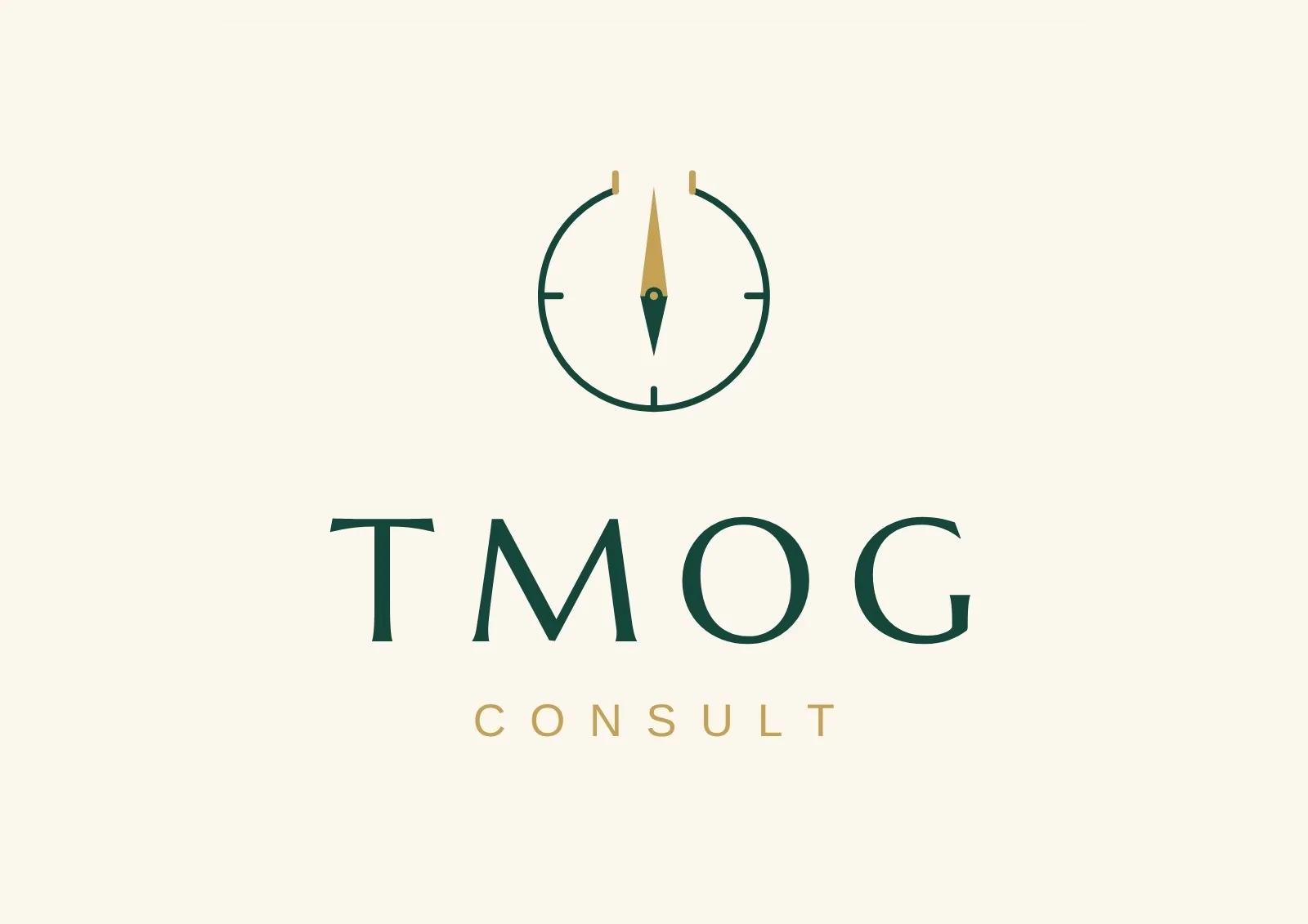
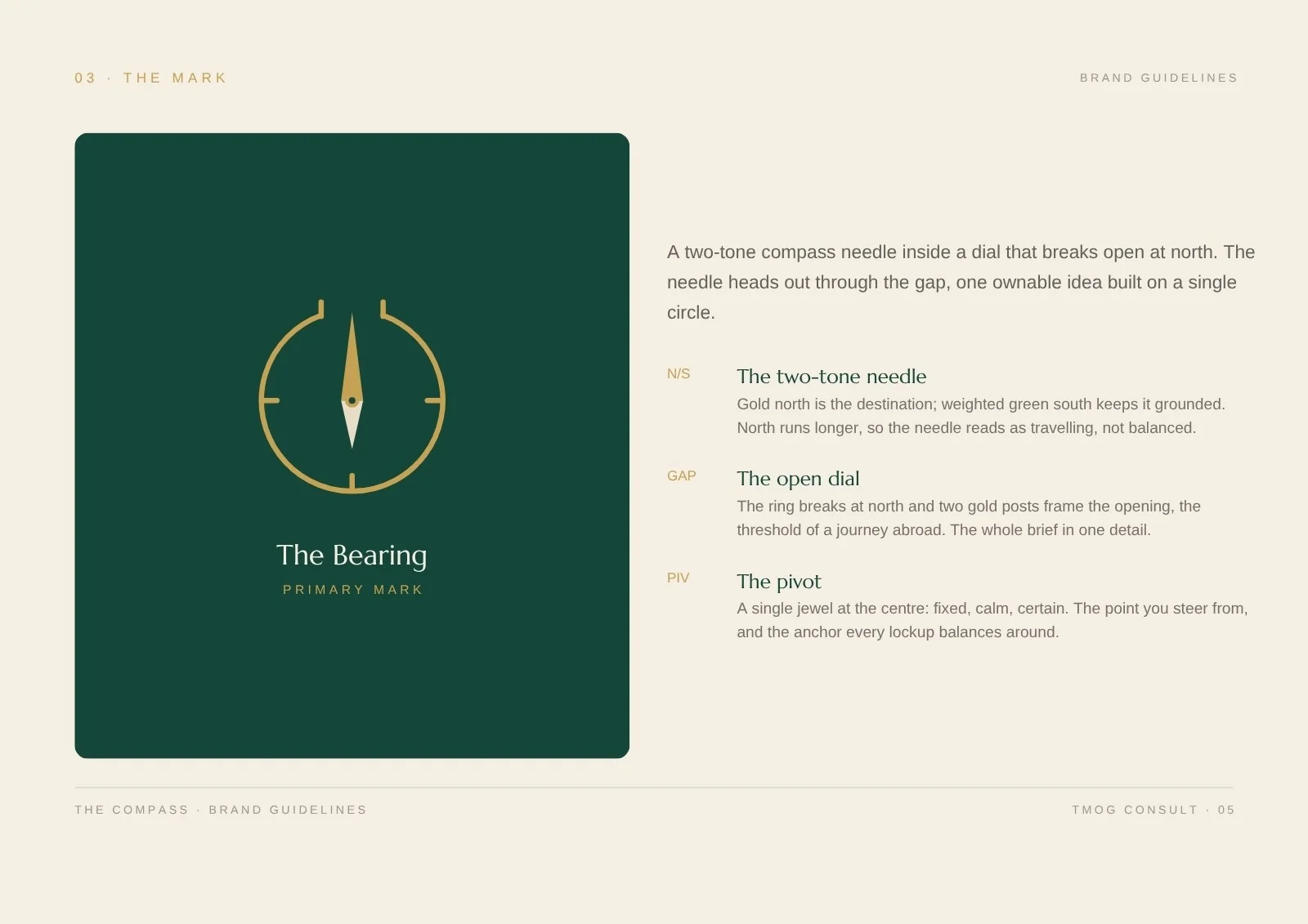
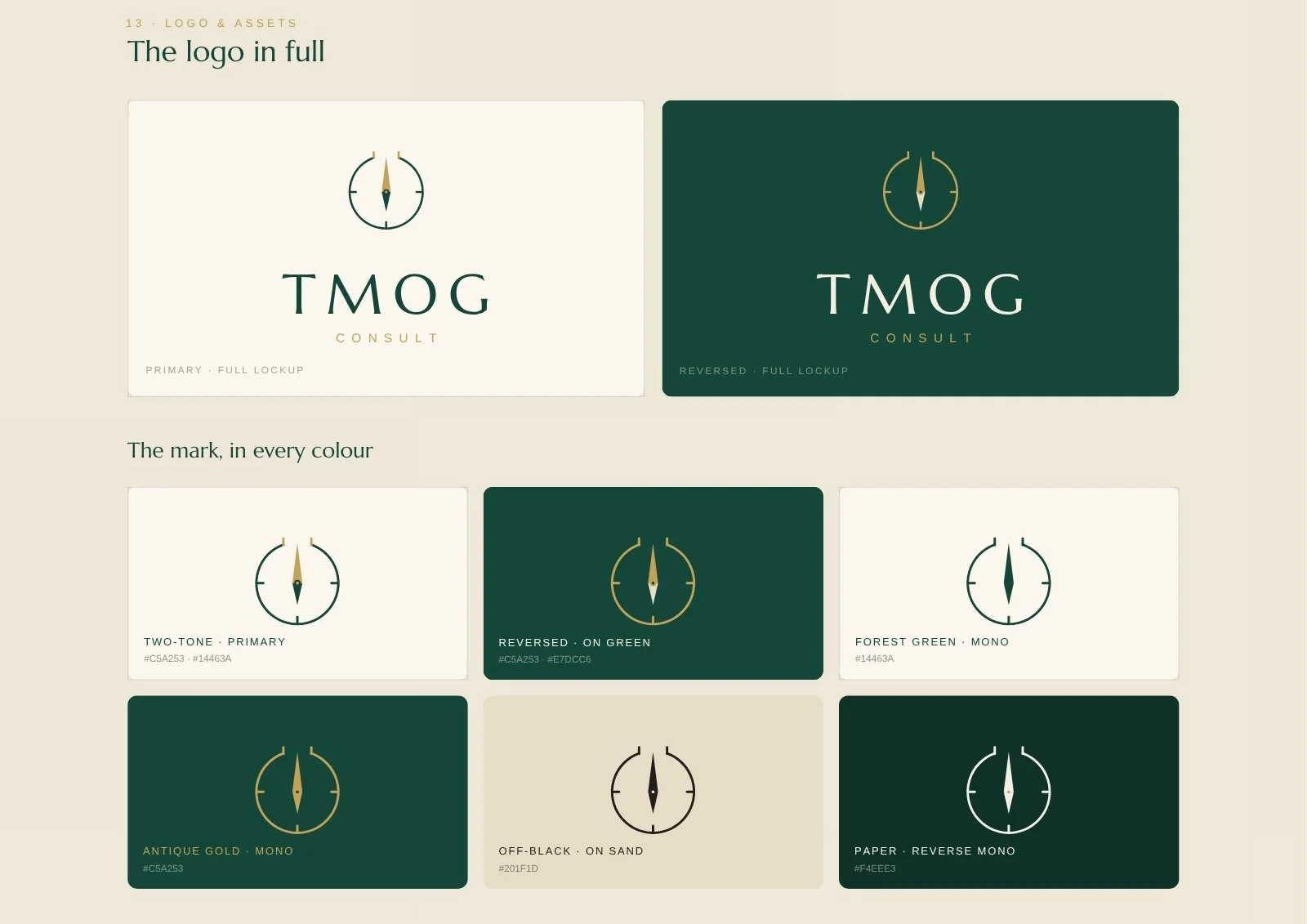
The Bearing: a two-tone compass needle inside a dial that breaks open at north. The needle heads out through the gap, the threshold of a journey abroad, built on a single circle.
Reference available: the TMOG Consult team is happy to speak about this project.
Personal brand and media platform for men
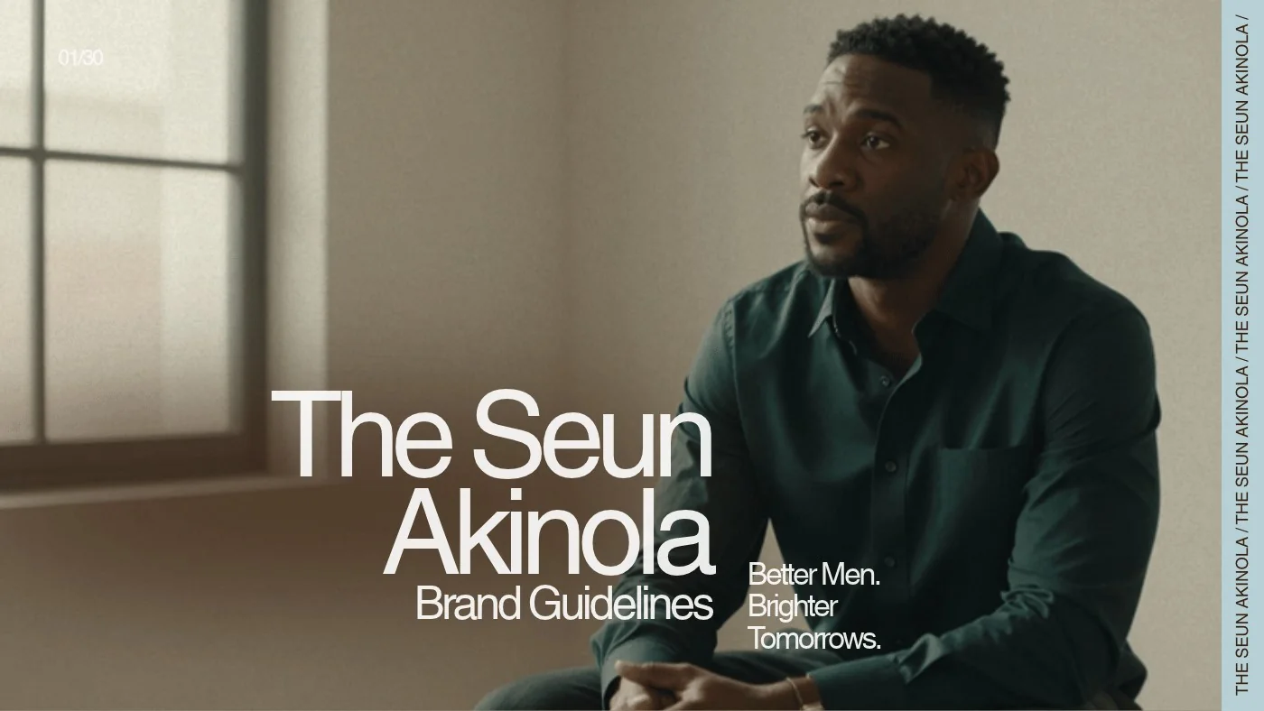
“Better Men. Brighter Tomorrows.”
A personal brand built around one idea: when men grow emotionally, spiritually and in character, everything around them improves. It had to speak to men at every stage, without preaching.
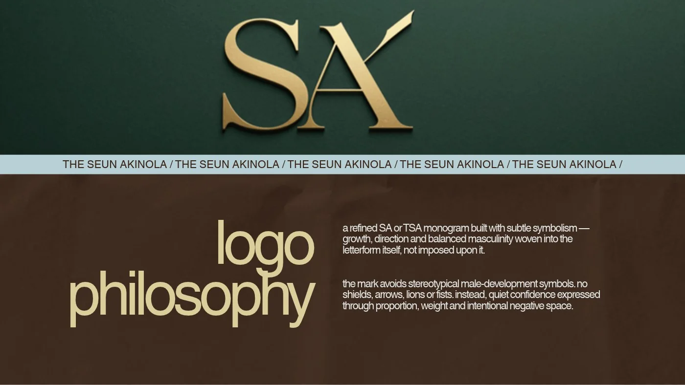
An editorial, documentary feel, like a well-made men's magazine, with a refined SA monogram at its centre and a voice like a wise older brother: simple, honest and warm.
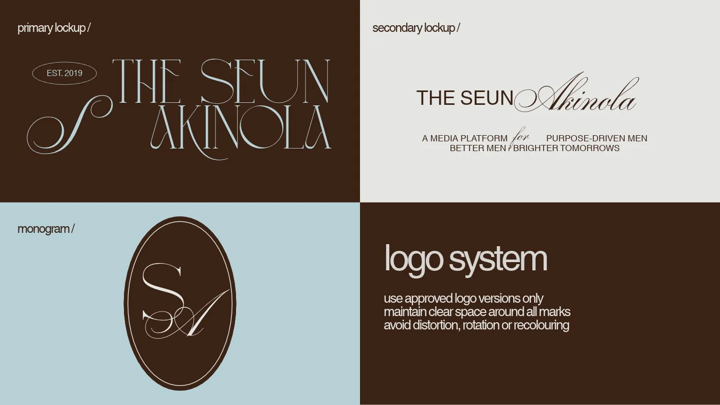
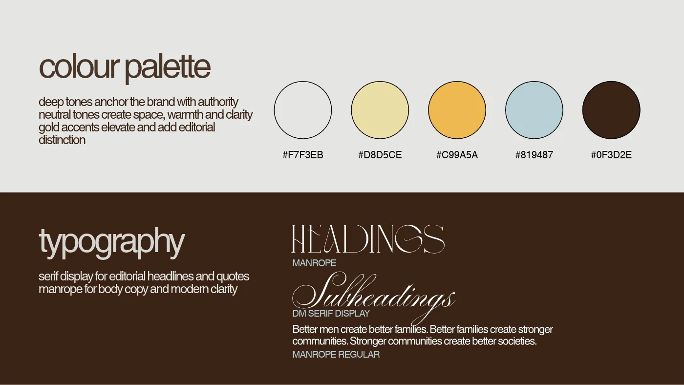
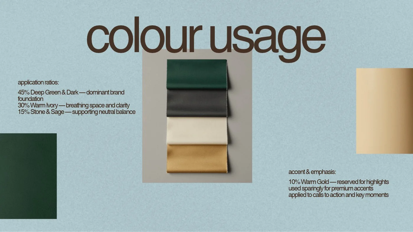
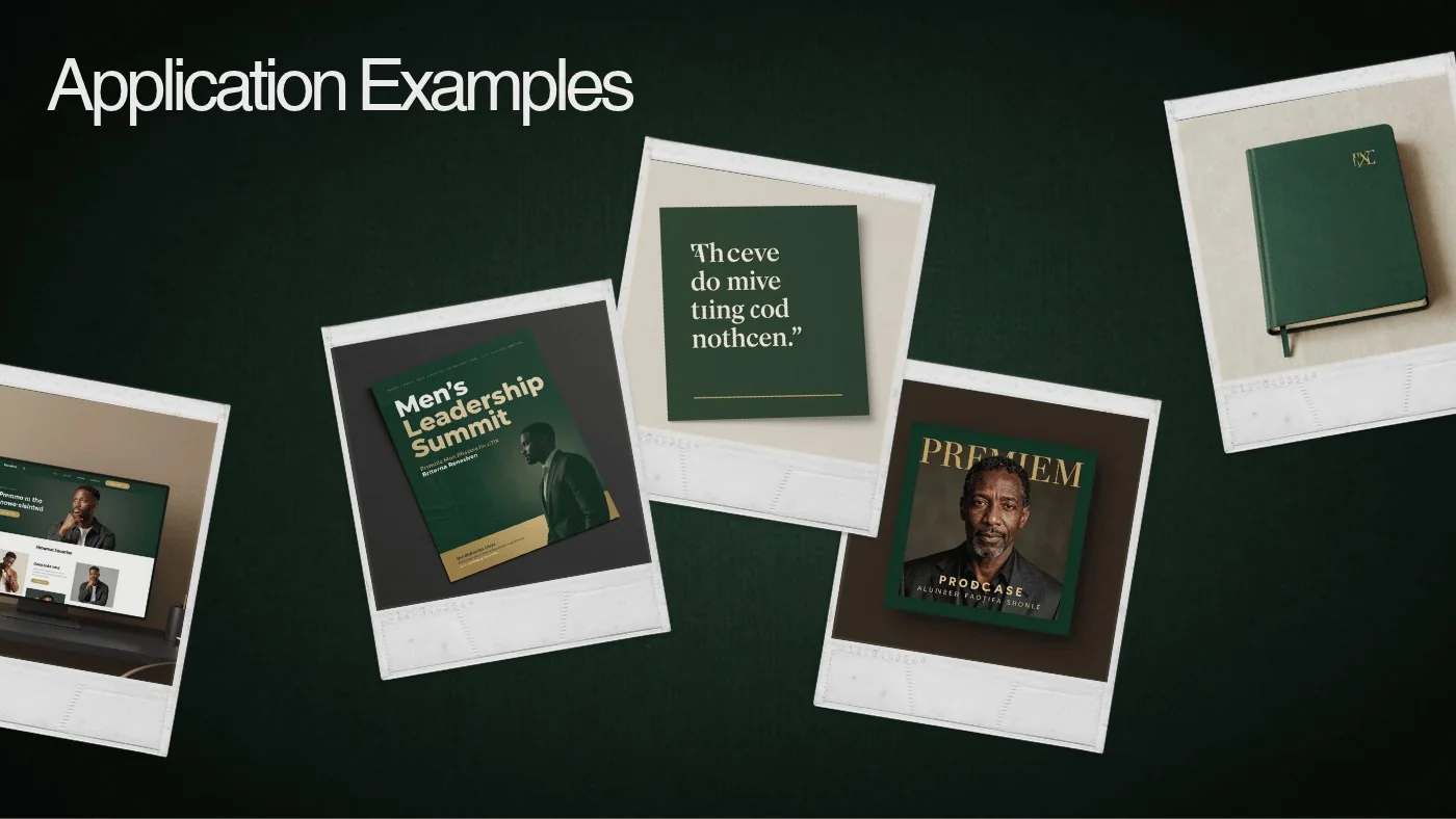
Reference available: The Seun Akinola is happy to speak about this project.
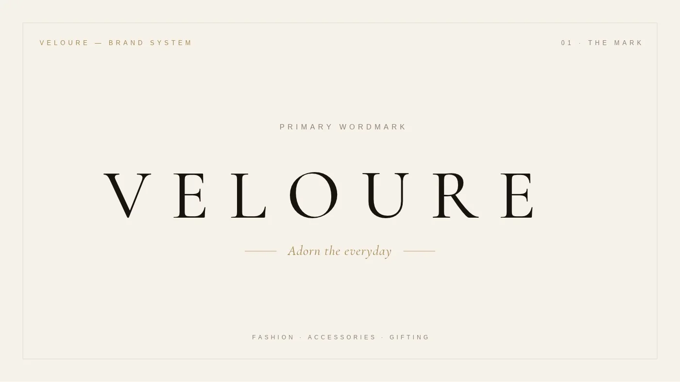
Fine accessories · Jewellery, watches, bags and scarves
“Adorn the everyday.”
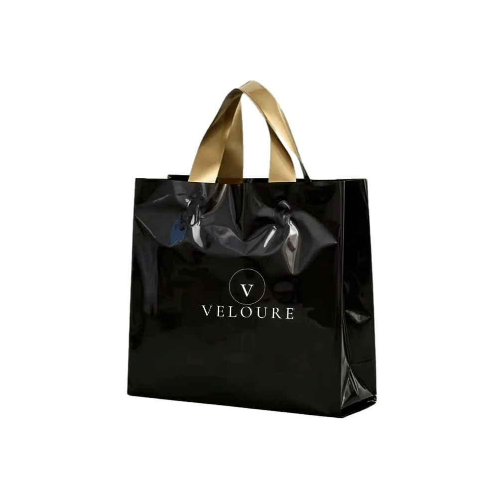
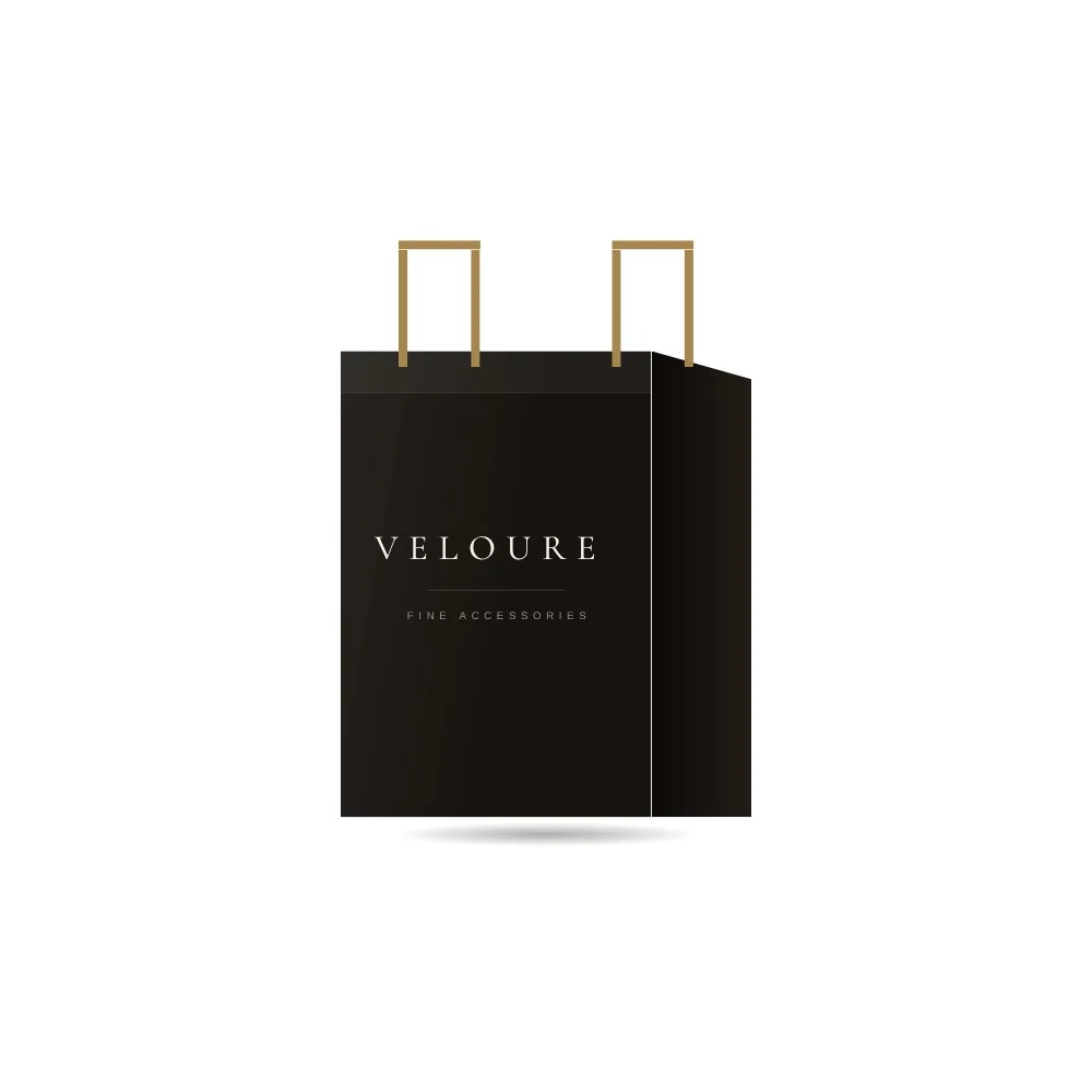
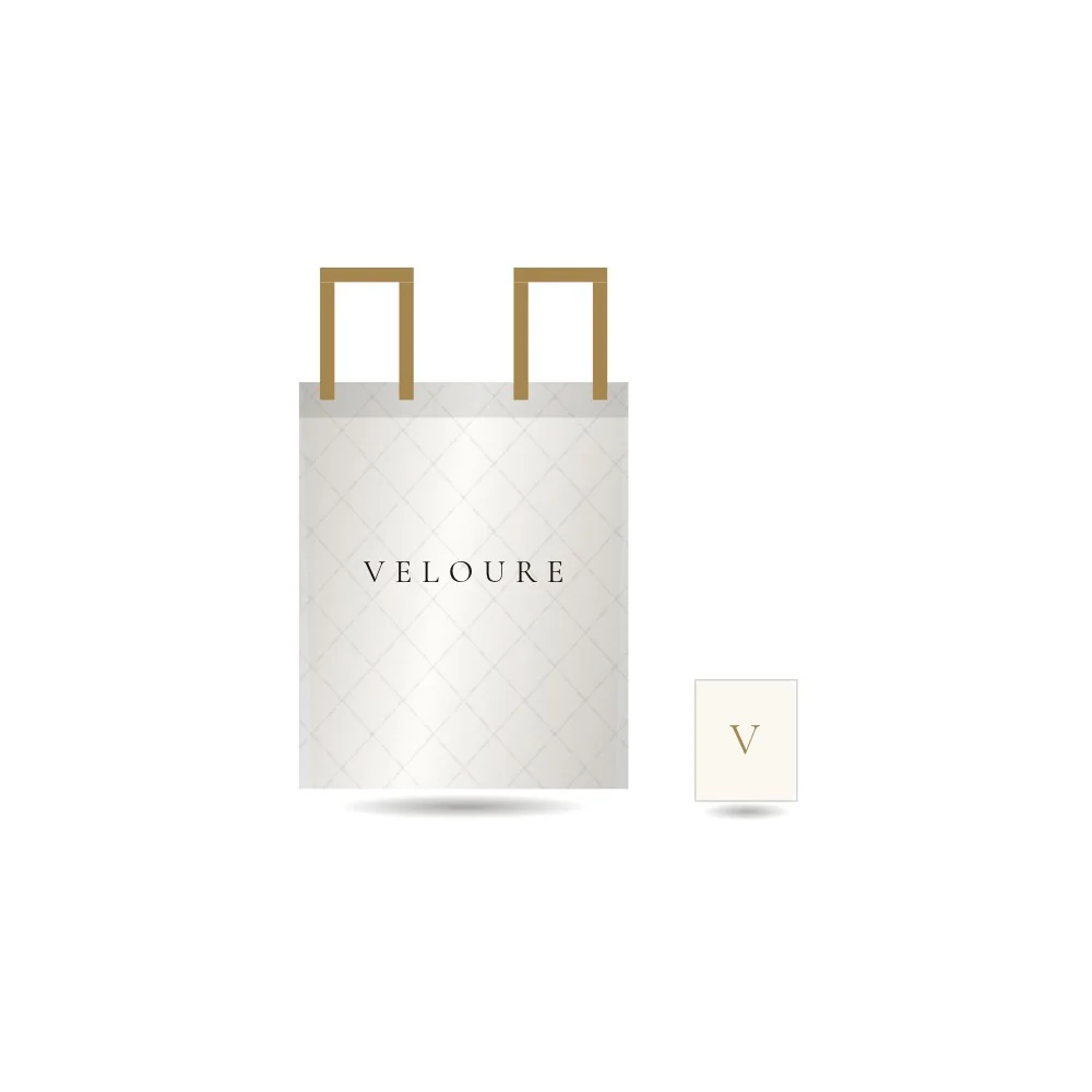
A house of everyday luxury, where every accessory feels like a gift worth keeping. The brand needed to look established from day one and carry across a full range of packaging.
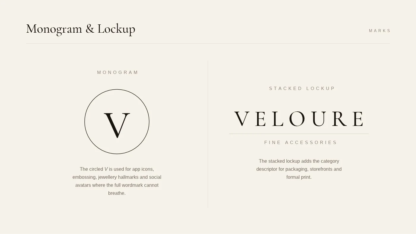
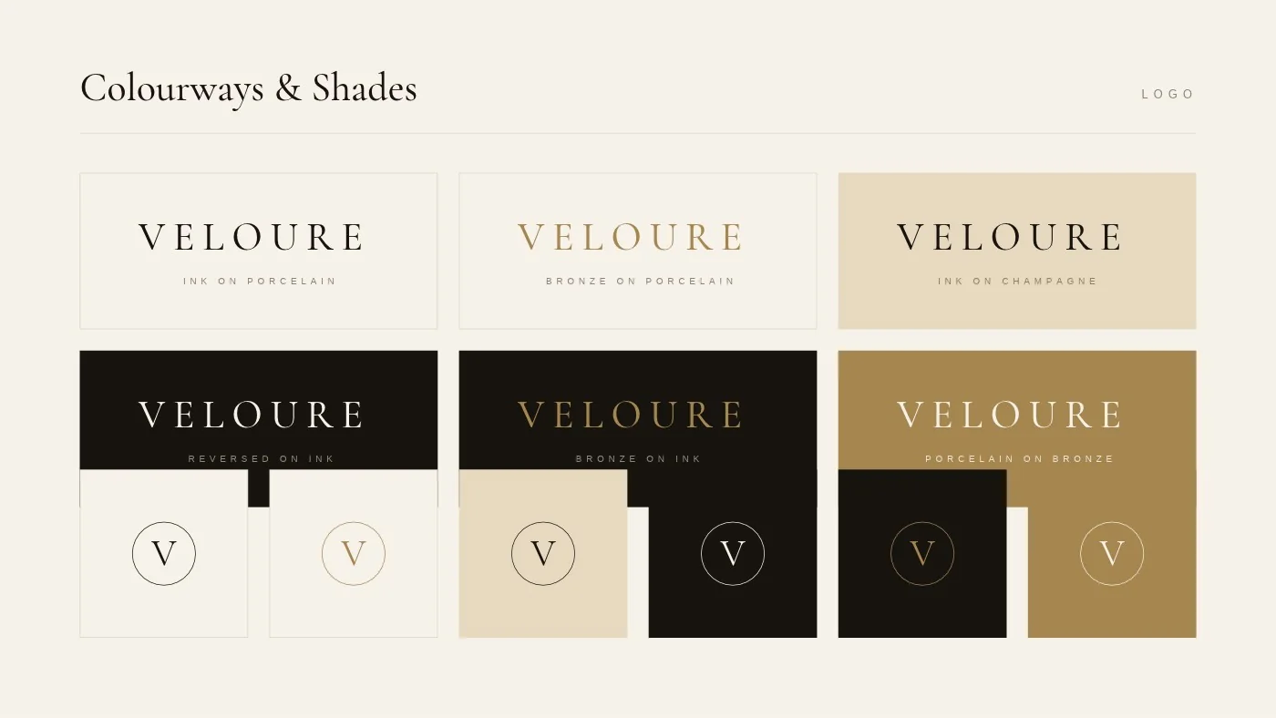
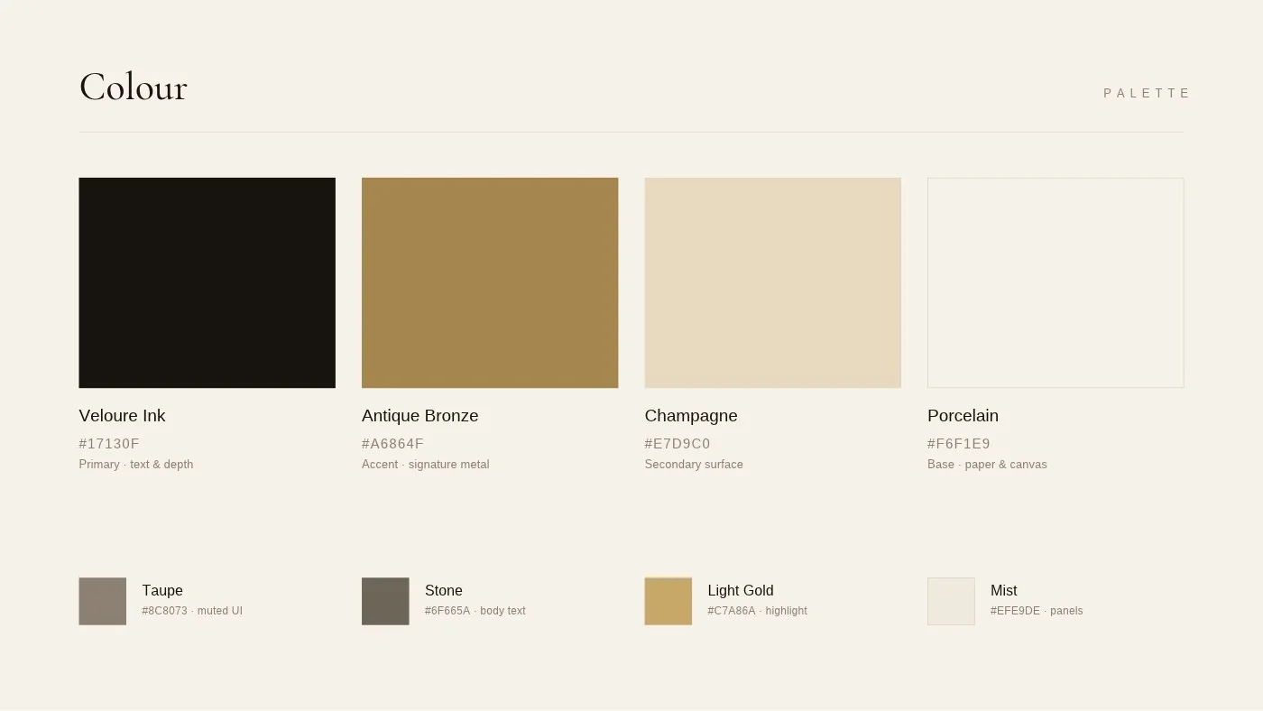
A spaced, engraved-style wordmark and a V monogram in a fine ring, in ink, antique bronze and champagne. Quiet enough to let the product lead, distinctive enough to own a shelf.
Fashion and lifestyle house
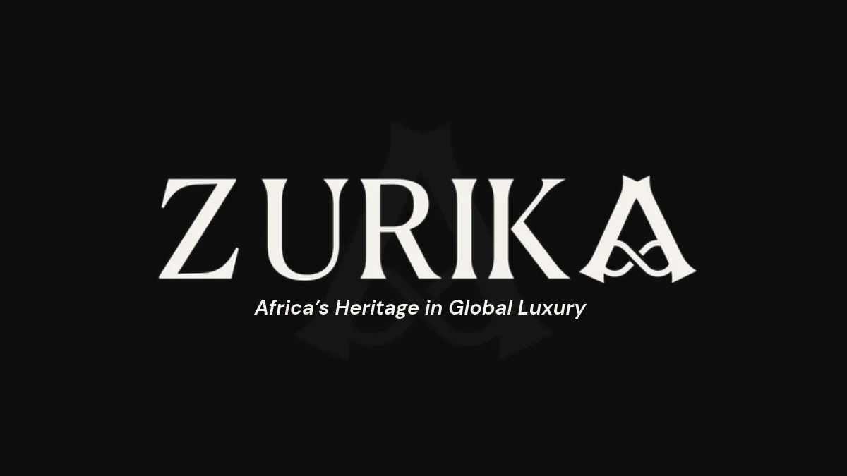
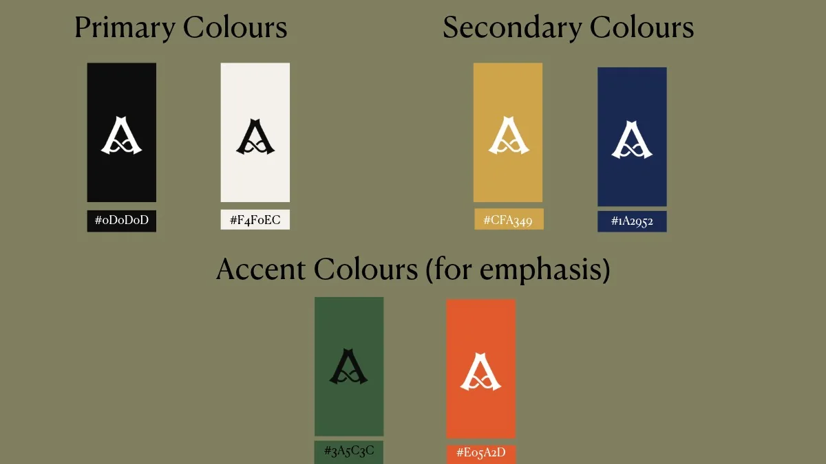
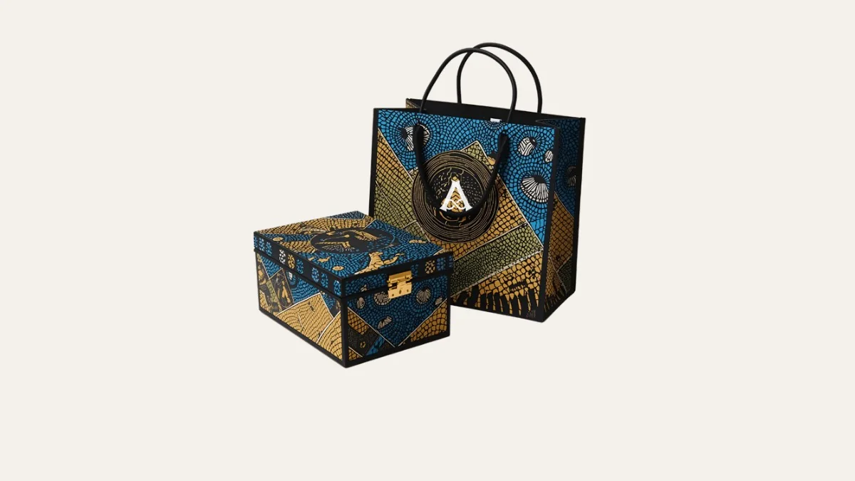
“Africa’s heritage in global luxury.”
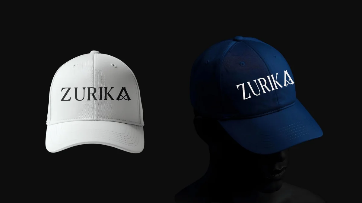
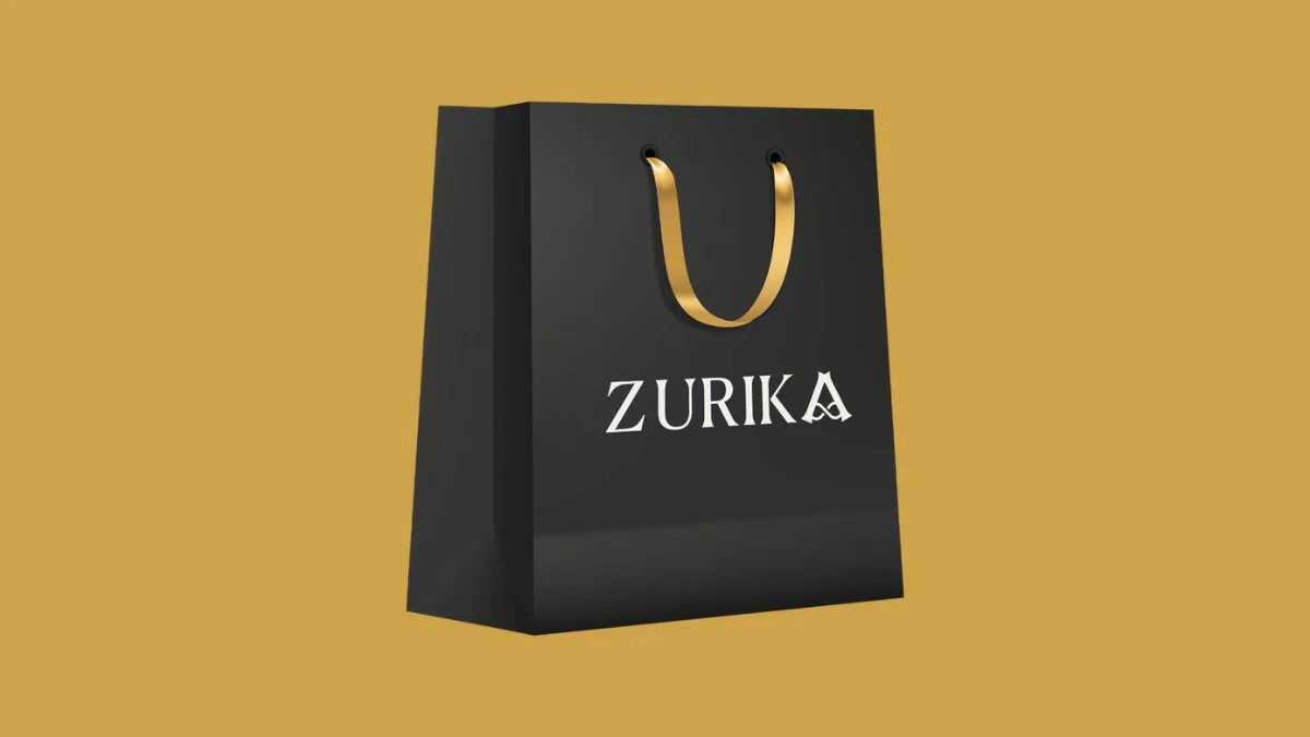
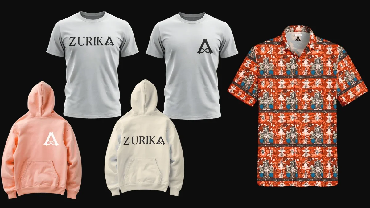
A luxury house that celebrates African craft, heritage and artistry, and needed to feel at home next to global fashion names, from the website to the shopping bag.
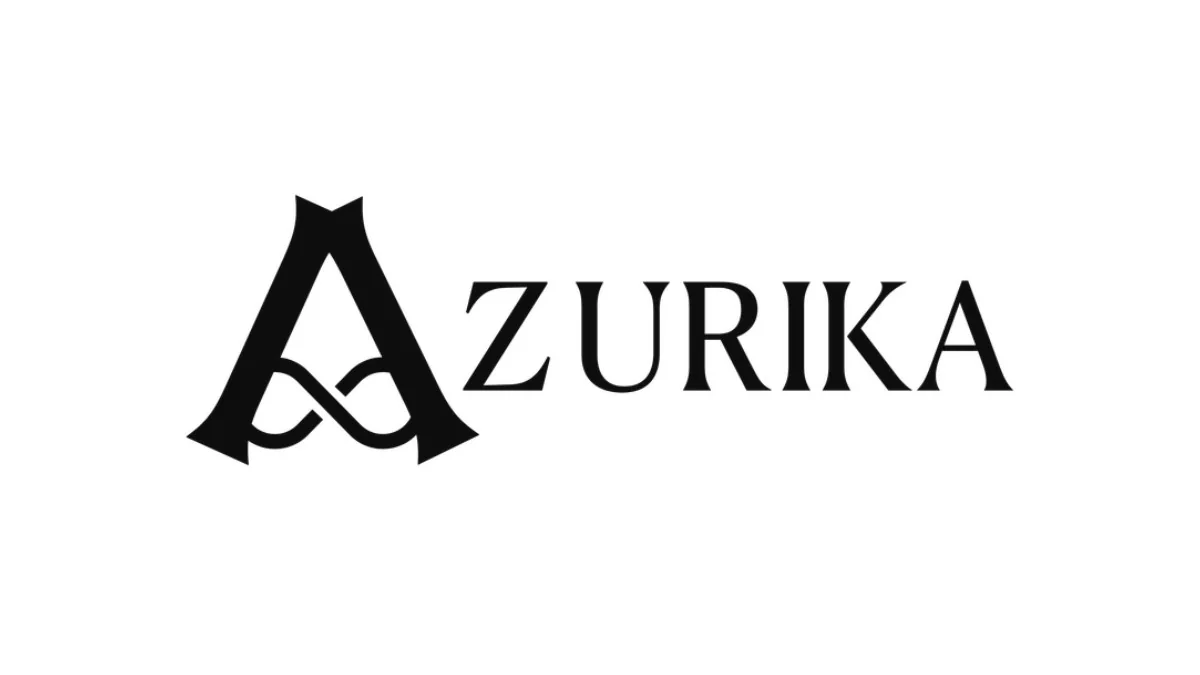
A sculpted A-mark that doubles as a crest, set in a bold serif wordmark, with deep heritage colours and rich, textile-led art direction. Wise, proud, aspirational and global.
Infrastructure and construction
“Plan precisely. Build once.”
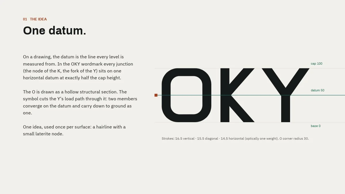
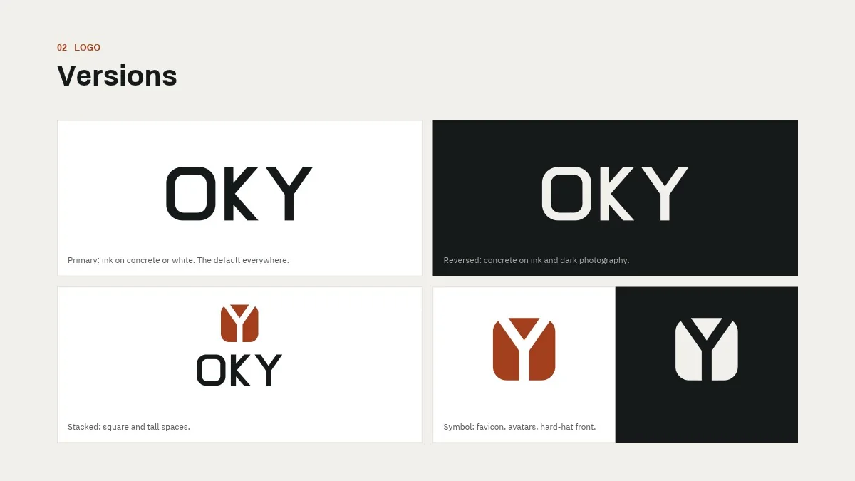
An engineering company building roads, drains and power lines needed a brand that looks as exact as its work, on a proposal, a signboard on site or a safety vest.
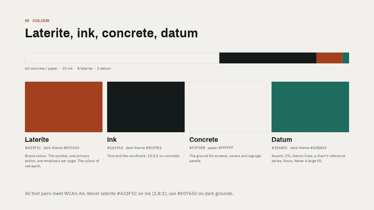
One datum. Like a survey line on a drawing, a single reference line runs through the wordmark and the whole system, in laterite, ink, concrete and green.
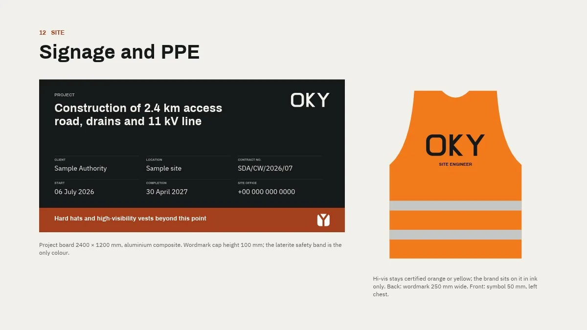
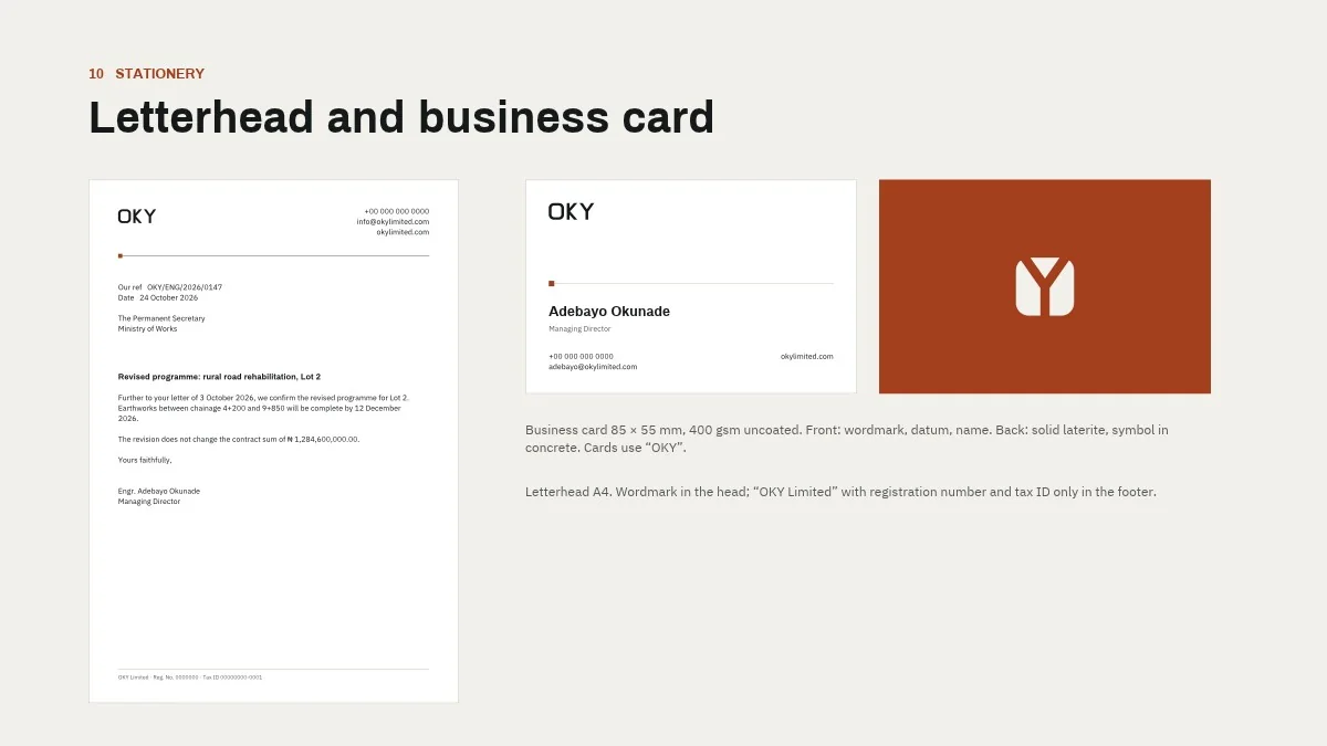
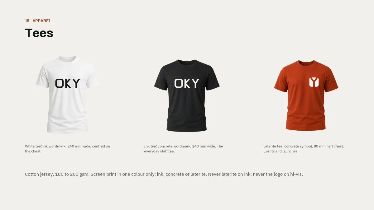
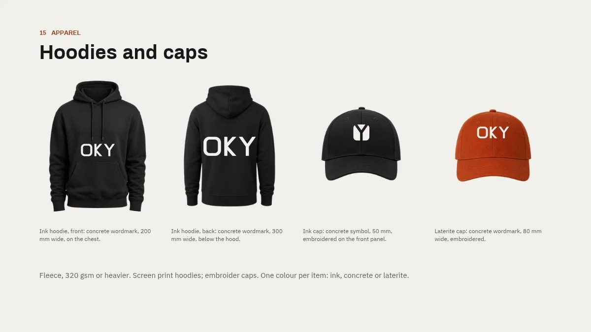
Reference available: OKY Limited is happy to speak about this project.
AI business intelligence for e-commerce sellers
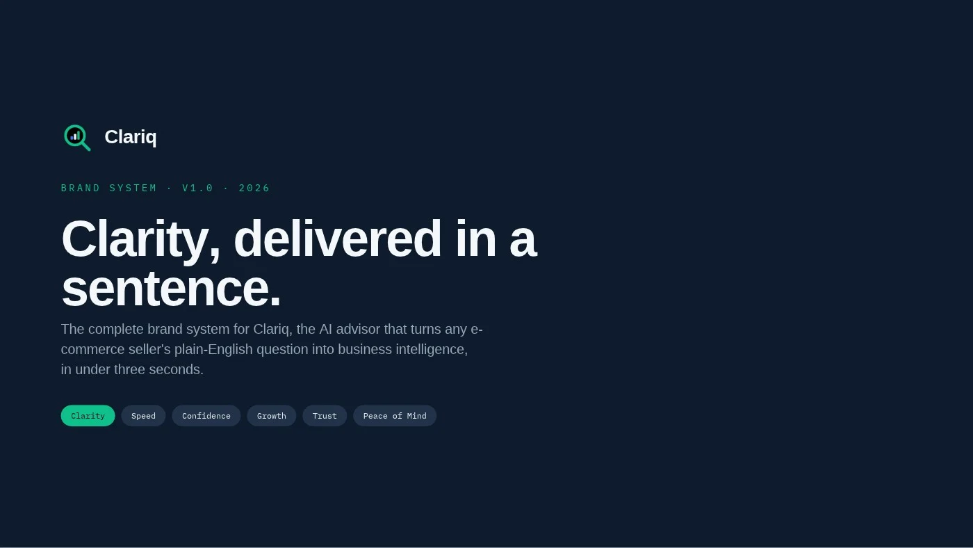
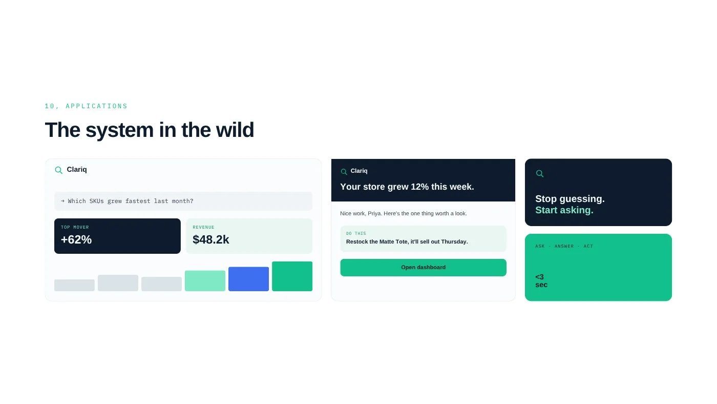
“Clarity, delivered in a sentence.”
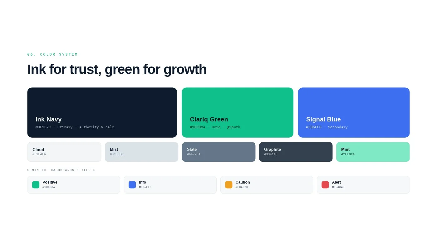
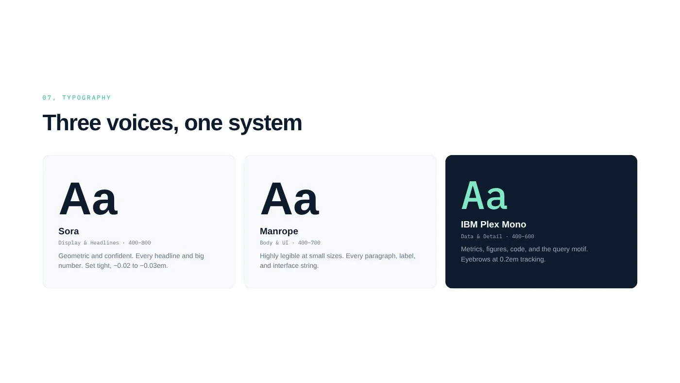
Clariq is an AI advisor that answers an online seller’s plain-English question with real business intelligence in seconds. The brand had to feel confident, clear and quietly smart: never hyped, never academic.
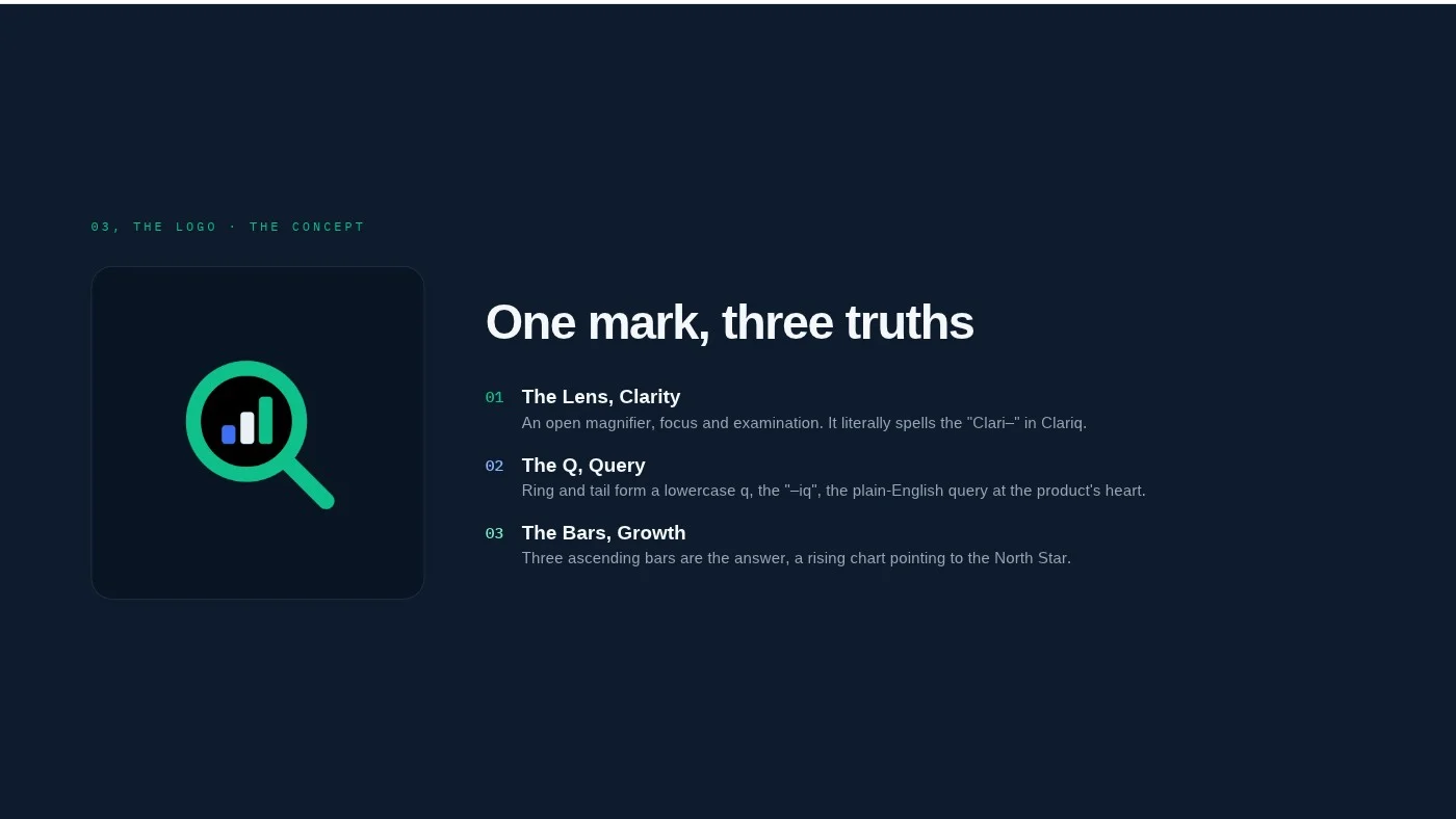
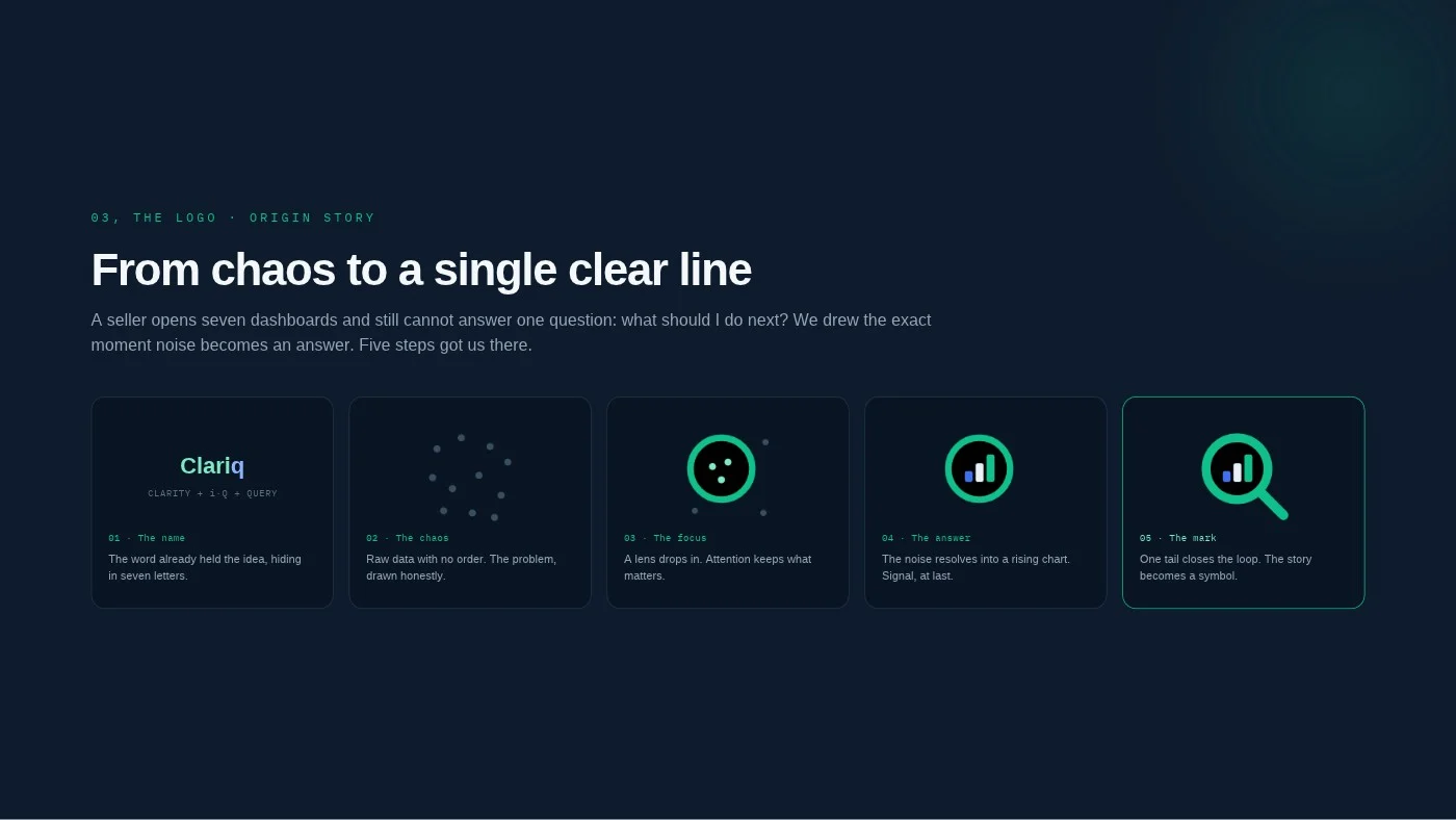
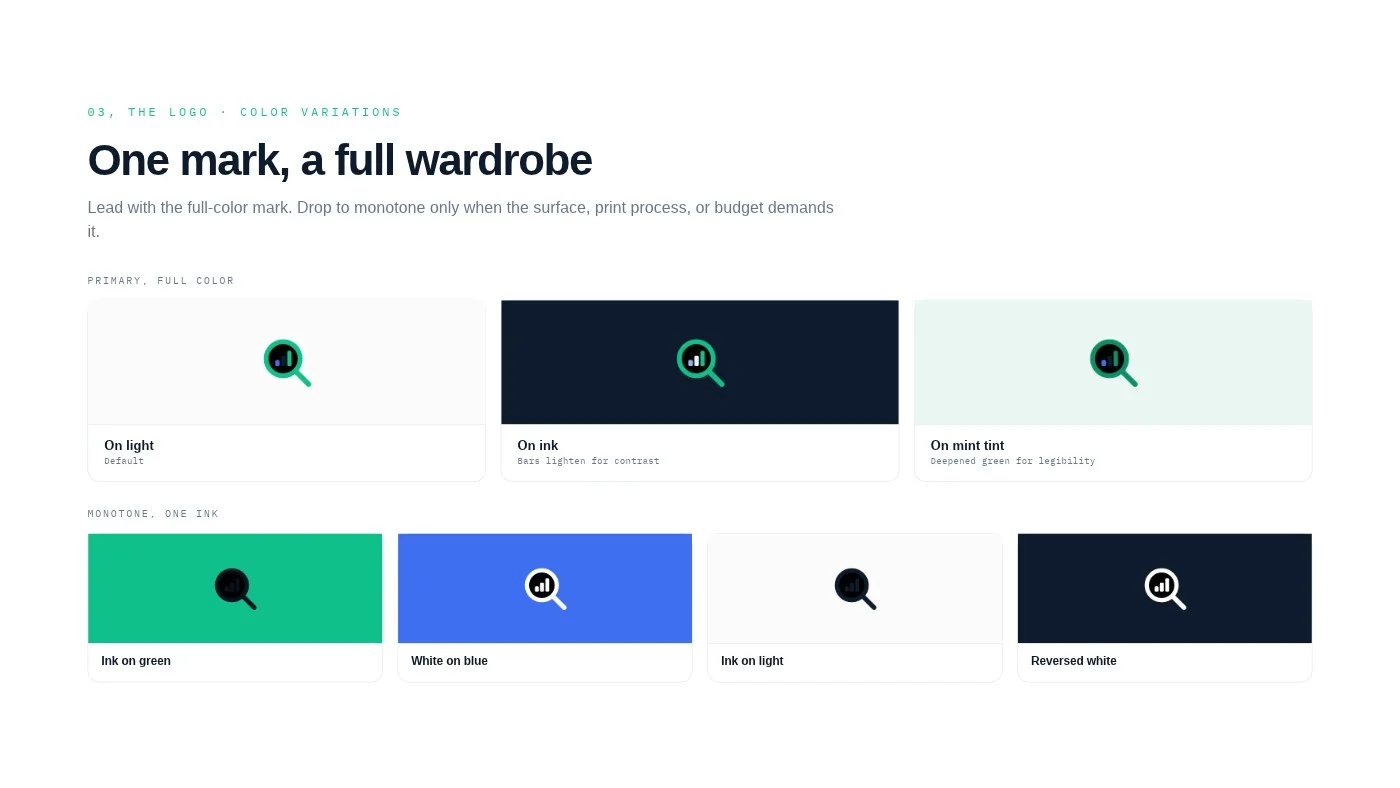
One mark, three truths. A lens for clarity, its ring and tail drawn as the Q of a query, and three rising bars inside for growth. From seven dashboards to a single clear line.
Fashion and beauty house
“Elegance is quiet.”
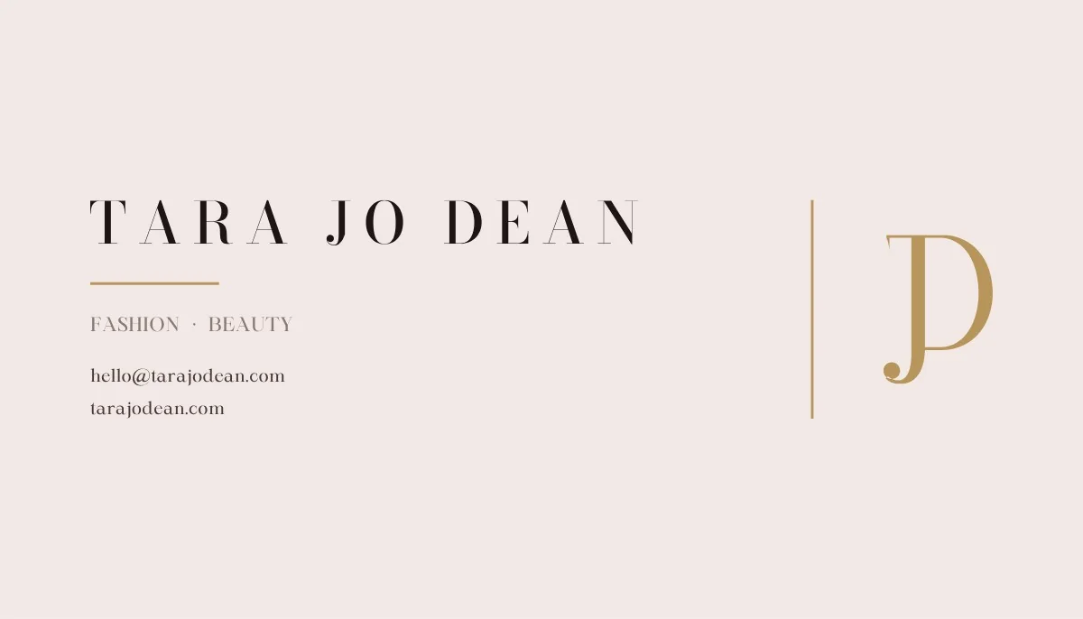
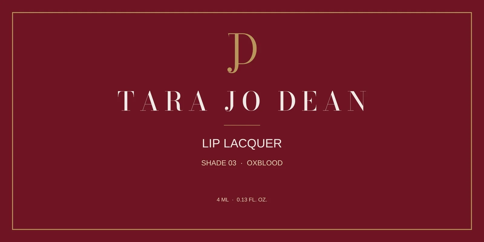
A house of fashion and beauty for the woman who dresses with intention. Timeless, refined, feminine and assured: the kind of name that belongs on a lipstick box and a shopping bag alike.
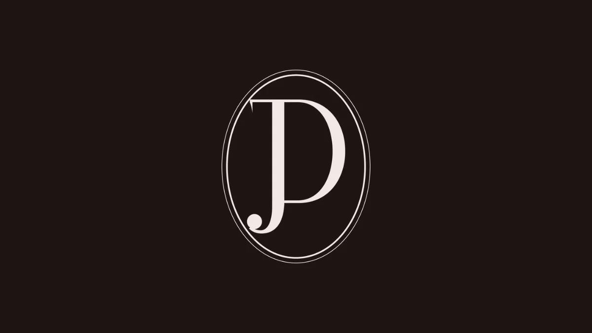
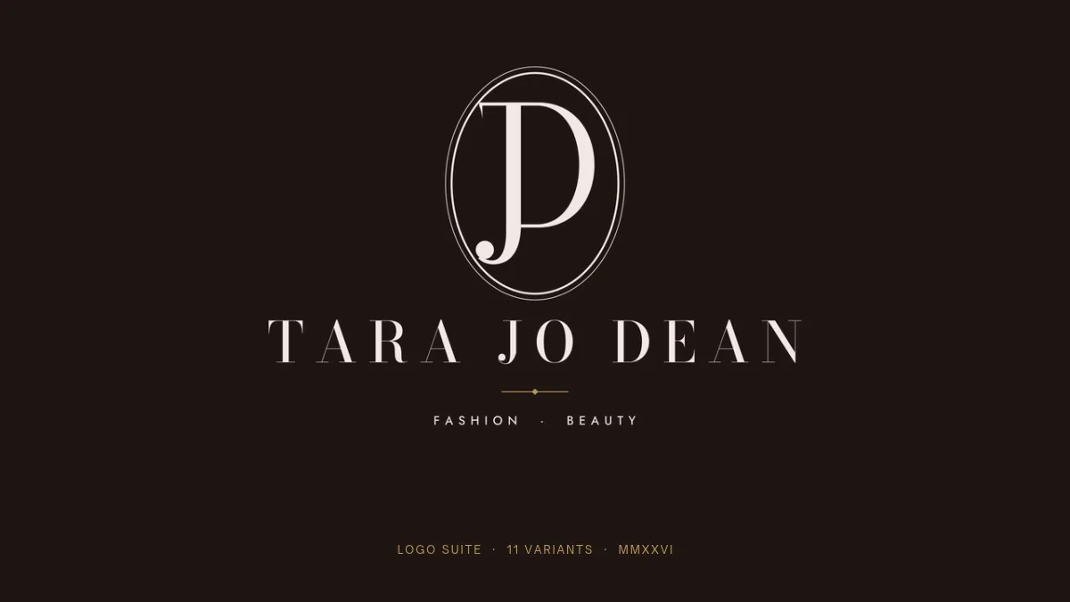
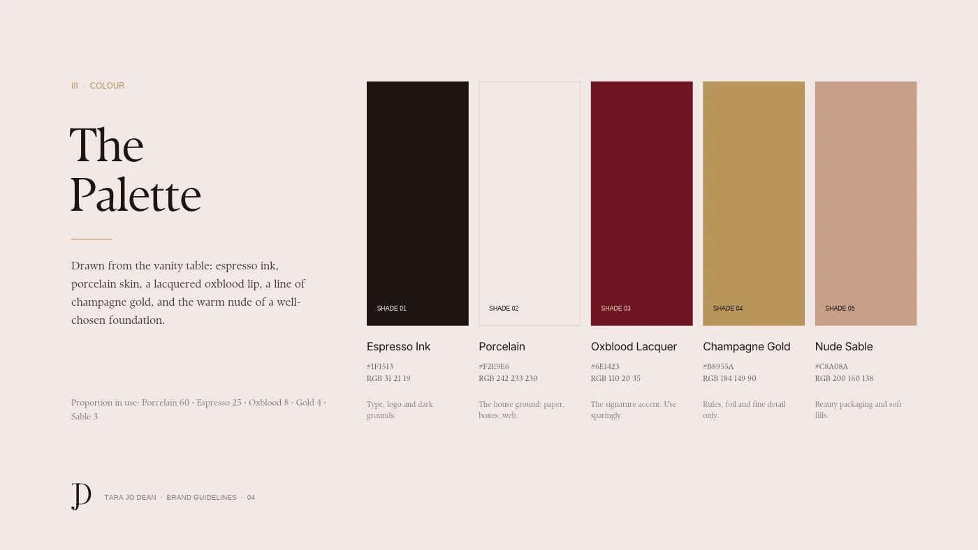
A JD monogram drawn as one continuous gesture inside a fine oval, paired with a widely spaced serif wordmark, in espresso, porcelain, oxblood and champagne gold.
Four more brand systems, each with its own logo, colour, type and guidelines.
AI automation and growth company. Logo, colours, type system and brand guidelines.
A brotherhood for men. One cross, four colours, three typefaces and a brand deck.
Considered womenswear. Monogram, palette, type and a full design system.
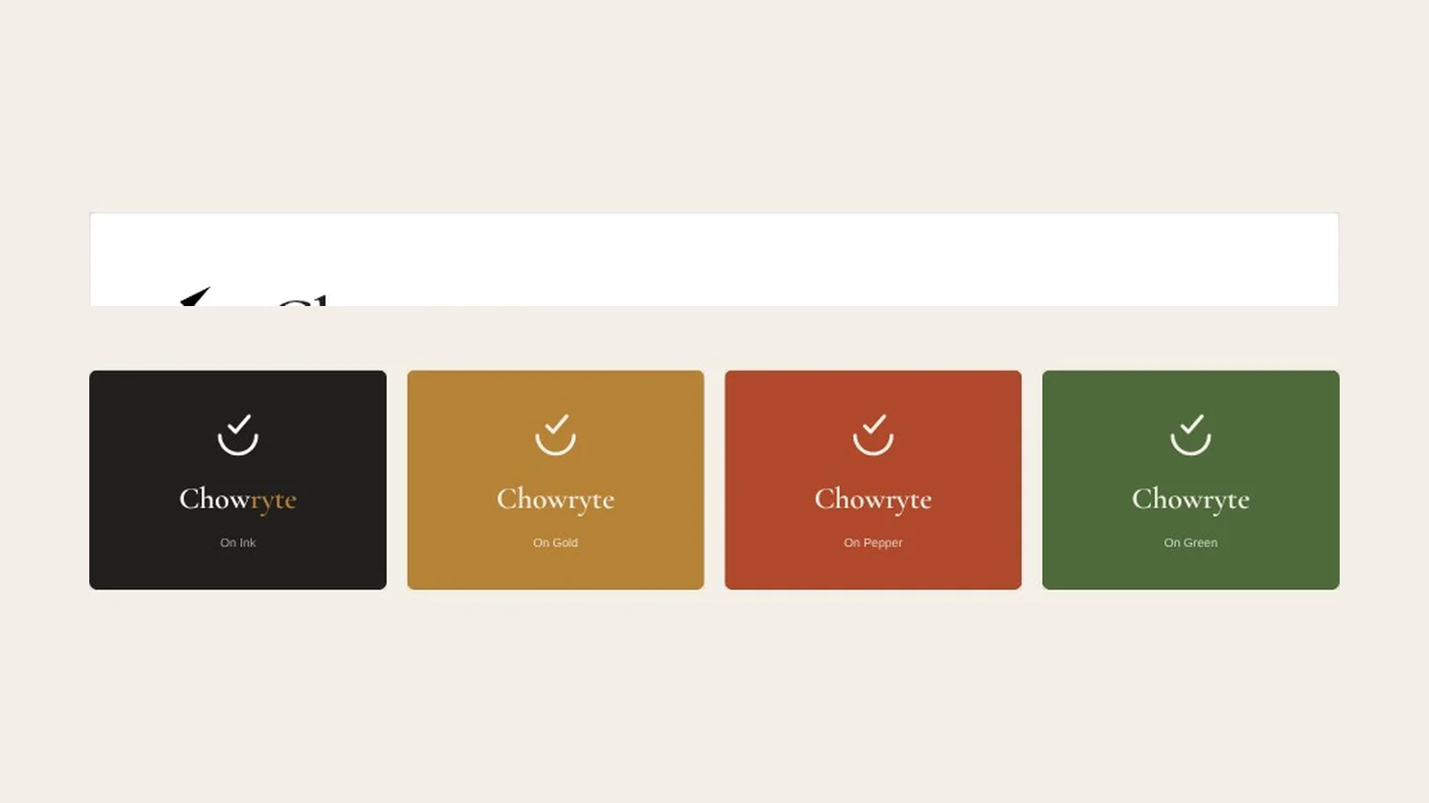
Food brand. Wordmark, warm palette, editorial voice and product UI.
Marks and brand campaigns for growing businesses.

These clients have agreed to speak about working with me. Tell me which project you’d like to hear about and I’ll introduce you directly.
Tell me what you’re building and who it’s for. I’ll come back with how I’d approach the identity, what you’d get and a clear price.